
Friday, 20 December 2013
Sunday, 15 December 2013
Ideology
Ideology can be defined as "a set of conscious and unconscious ideas that constitute one's goals, expectations and actions." Ideology is used very effectively in many different magazines, such as to establish the target audience.


For example, from the front cover of this issue of We <3 Pop, you can distinguish that the magazine is targeted towards a young female audience by the use of colours usually linked to females such as pink and yellow, focusing on fashion and pop music and the fact that the female celebrities shown in the magazine are portrayed in a very positive and important light, while the males featured are posed and dressed formally, appealing to the young female audience.
By contrast, the front cover of this issue of NME can be shown to be identified at a male audience as it features colours such as black and green compared to the fluorescent colours of We <3 Pop, includes more male musicians in a dark light as opposed to the "girl power" vibe given off by We <3 Pop, and uses a different variety of fonts on the cover, again differing with the single font used on We <3 Pop.
Wednesday, 11 December 2013
Scripting of Double Page Spread
TRAPPED IN THE MAZE… AND THERE’S NO WAY
OUT
Its 12:30pm when Liam Maher,
better known by his stage name – “The Maze”, struts into the fluorescent,
empty, warm studio. As he calmly sits on the chair laid out for him, a massive
grin creeps on to his face before asking me “Y’alright?”
2013 has been an incredible
year for Maher. His debut single “Lost in The Maze” reached #1 in the Charts in
42 different countries within one week of being released. Also, his self-titled
album reached #1 in the Charts globally, gaining Platinum-status 5 times and
breaking records as the biggest debut for an independent artist ever.
“I don’t think that I could
ever have predicted the amount of success that I’ve had this year…” Maher
chuckles, wide-eyed. “It still feels incredibly unreal that I’m here… I still
feel like I should be working at my old job in Subway, making Meatball
Marinaras for posh w*nkers who can’t be bothered to do it themselves.” He
smirks, shaking his head, jokingly.
As well as his blatant
musical and lyrical genius, Maher has also received several fans for his
comedic and topical tweets, with his Twitter profile “@MazeyMaher” currently at
11 million followers and counting. Responding to a question of him being
labelled “the Robert Downey, Jr. of independent music”, Maher laughs. “Well,
for a start, I’m not f*cking Iron Man! I think he has me beat there.” Putting
on a serious smile though, Maher continues: “Seriously though, I’m quite good
friends with Rob… he’s one of the funniest and most genuine people I’ve ever
met.” It seems that these feelings are mutual, with Downey, Jr. referring to Maher
as one of the best musicians of the past 50 years.
However, it’s not all joking
about with Maher. He has shown a serious side when speaking about and donating
half of his royalties to organisations trying to stamp out poverty in
third-world countries. “It’s an issue I feel incredibly strongly about… I
visited Africa in my GAP year and was f*cking horrified at what I saw. People
shouldn’t have to live like that. That’s why it needs to change.”
Maher has also become well-respected in the gay community since a video went viral of him intervening and stopping a homophobic attack on a young boy by fellow “musicians” MC Willy C and Dominic Breeze. “You should be allowed to be who you are without being attacked, regardless of sexuality. I will not tolerate bullying of any kind, man, you know?” He looks up, smirking. “If you want to attempt to be f*cking big men and attack people, try that s*it with me.”
Maher has also become well-respected in the gay community since a video went viral of him intervening and stopping a homophobic attack on a young boy by fellow “musicians” MC Willy C and Dominic Breeze. “You should be allowed to be who you are without being attacked, regardless of sexuality. I will not tolerate bullying of any kind, man, you know?” He looks up, smirking. “If you want to attempt to be f*cking big men and attack people, try that s*it with me.”
All in all, you’d think that
after the huge success that Maher has gained, he’d want to take things more
slowly. However, this is not the case. “I’m going to keep going, bigger and
better than before!” He vows. “The reason I’m called ‘The Maze’ is because once
you hear my music, you’re addicted and I’ve got you trapped in my theoretical
maze.” He laughs loudly. “I owe it to my fans. You go hard or go home.”
Tuesday, 10 December 2013


Monday, 9 December 2013
Fonts
In order to choose the perfect title font for my Media Music Magazine, I have narrowed down my selection to 5 fonts from www.dafont.com. Here are the selections:
The first font is called HACKED:
 The reason that I chose this font as one of my selections is that it has a distorted yet professional and neat look that would fit in well with my magazine, as well as linking in well with the independent underground vibe that I am going for.
The second font is called BROKEN GLASS:
 The reason that I chose this font as one of my selections is again that it fits in well with the tone and look that I want my magazine to have as well as the eye-catching effect that it may have on my target audience.
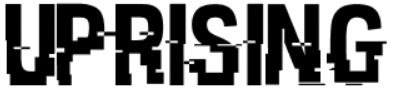
The third font is called WRESTLEMANIA:
 The reason that I chose this font is that it bears similarities to other music magazines of my genre that I have looked at in my research, making my magazine look and feel professional while relating quite strongly to other magazines of the same genre. Out of all the fonts, I feel that this one is my favourite.
The fourth font is called KG DEFYING GRAVITY:
 This font was the first font that I looked in to on the website, however I don't think that it suits the genre of my magazine, making it look cartoonish and blocky, contrasting with how I want my magazine to be presented.
The fifth and final font is called PLANE CRASH:
 The reason that I chose this font is because it looks very gritty and eye-catching, fitting in with the tone of my magazine.
The first font is called HACKED:
The reason that I chose this font as one of my selections is that it has a distorted yet professional and neat look that would fit in well with my magazine, as well as linking in well with the independent underground vibe that I am going for.The second font is called BROKEN GLASS:
The third font is called WRESTLEMANIA:
The fourth font is called KG DEFYING GRAVITY:
The fifth and final font is called PLANE CRASH:
Subscribe to:
Posts (Atom)