In order to choose the perfect title font for my Media Music Magazine, I have narrowed down my selection to 5 fonts from www.dafont.com. Here are the selections:
The first font is called HACKED:
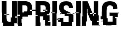
The reason that I chose this font as one of my selections is that it has a distorted yet professional and neat look that would fit in well with my magazine, as well as linking in well with the independent underground vibe that I am going for.
The second font is called BROKEN GLASS:
The reason that I chose this font as one of my selections is again that it fits in well with the tone and look that I want my magazine to have as well as the eye-catching effect that it may have on my target audience.
The third font is called WRESTLEMANIA:
The reason that I chose this font is that it bears similarities to other music magazines of my genre that I have looked at in my research, making my magazine look and feel professional while relating quite strongly to other magazines of the same genre. Out of all the fonts, I feel that this one is my favourite.
The fourth font is called KG DEFYING GRAVITY:
This font was the first font that I looked in to on the website, however I don't think that it suits the genre of my magazine, making it look cartoonish and blocky, contrasting with how I want my magazine to be presented.
The fifth and final font is called PLANE CRASH:
The reason that I chose this font is because it looks very gritty and eye-catching, fitting in with the tone of my magazine.


No comments:
Post a Comment